

 Language
 中文简体
中文简体 русский
 Español
 Deutsch
 عربى
عربىEyeshadow

 0
0
Product
Didn't find the product you like?
We gonna help you find matched one fast
Popular Products

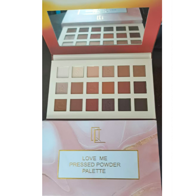
Why Are Eyeshadow Palette Balancing Cool And Warm Shades?
2026-03-20
Color trends for 2026 show a distinct yet nuanced duality, and Eyeshadow Palette and Eyeshadow Palette Factory production are adapting accordingly. On one hand, searches for "Cool Blue" shades, including gray and silver tones, are increasing as consumers explore modern, understated eye makeup. On the other hand, warmer shades like "Plum Noir," chocolate brown, and metallic copper remain popular, reflecting a continued appreciation for depth and richness. Factories and brands now face the challenge of combining these cool and warm shades within single palettes, offering visually interesting contrasts while maintaining practical usability for everyday application.
How Do Eyeshadow Palette Factories Integrate Cool And Warm Tones?
Creating palettes that balance cool and warm shades requires careful design, formulation, and layout. Factories consider the following practical aspects:
- Shade Selection: Combining muted cool grays with warmer purples or browns to allow multiple complementary looks.
- Texture Variety: Mixing matte, satin, shimmer, and metallic finishes to emphasize depth and layering potential.
- Placement Strategy: Arranging shades logically to guide users from highlight to crease and outer corner applications.
- Pan Size and Compact Layout: Ensuring usability for both professional and personal applications, without making palettes cumbersome.
By addressing these production considerations, factories enable palettes that encourage experimentation while remaining approachable for consumers.
Why Are Cool Blues Gaining Attention While Warm Shades Persist?
The rising interest in gray and silver shades reflects a desire for understated, contemporary eye makeup, often associated with “90s nostalgia” and minimalist aesthetics. Cool shades can provide a neutral base, a soft transition color, or a bold accent depending on application.
Warm tones, including deep plum, chocolate, and metallic copper, continue to appeal due to their rich contrast and versatility. They can complement skin tones, create depth in the eye area, or provide warmth that balances cooler shades. The interplay between cool and warm colors allows users to construct layered, multidimensional looks, supporting creative expression across day and evening styles.
This duality is evident in palette design, where thoughtful curation ensures that both color families coexist without overwhelming the user. Factories respond by producing palettes that maintain consistent texture and blendability across contrasting tones, ensuring practical usability.
How Are Formulations and Manufacturing Adjusted for Shade Duality?
Modern Eyeshadow Palette factories pay close attention to formulation to maintain color integrity and application ease:
- Pigment Stability: Ensuring that both cool and warm tones retain consistent intensity and avoid cross-contamination during pressing.
- Texture Balance: Adjusting powder density and particle size to produce smooth, blendable shades for both mattes and shimmers.
- Packaging Considerations: Protecting lighter, reflective shades from fallout while keeping compacts portable and durable.
- Batch Consistency: Ensuring that multiple runs of the same palette reproduce the intended color balance for professional or retail distribution.
These adjustments help deliver palettes that function consistently across different makeup techniques and environments, supporting usability and creative flexibility.
What Practical Features Help Users Apply Dual-Tone Palettes?
Palettes combining cool and warm shades can be intimidating for some users. Factories and designers consider practical features to enhance usability:
- Logical Arrangement: Placing transition shades between cooler and warmer tones for easier blending.
- Guided Color Stories: Including suggested pairings for looks like day-to-night transitions or gradient effects.
- Mix of Finishes: Offering both matte and shimmer finishes to allow subtle layering or bolder accents.
- Compact and Portable Design: Ensuring pans are accessible and the palette can be transported without damage.
These features make it easier for users to navigate contrasting tones, experiment with new looks, and build confidence in applying layered makeup.
How Are Consumer Preferences Influencing Factory Practices?
Consumer interest in high-contrast, multidimensional looks is shaping production strategies. Factories are adjusting pigment sourcing, pressing methods, and packaging to accommodate palettes that combine cool and warm shades. Limited edition or seasonal collections allow experimentation with emerging color trends while maintaining consistent quality across runs.
Additionally, factories are incorporating feedback on palette usability, such as pan size, brush compatibility, and compact durability. These considerations ensure that even palettes with multiple textures and shades remain practical for both personal and professional users.
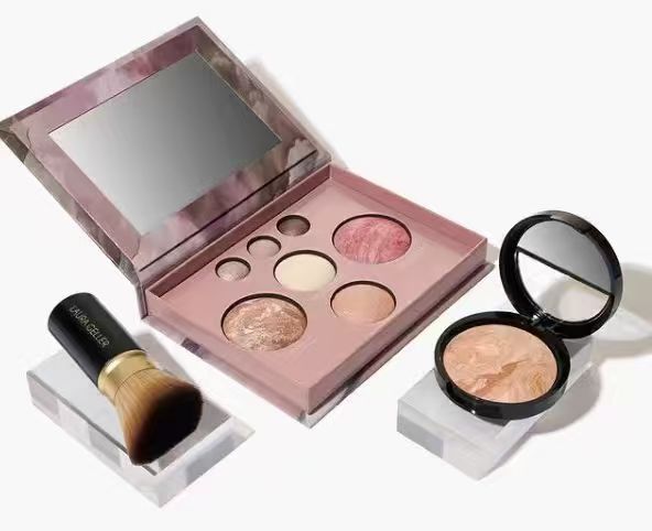
Related Product
- Custom Cost-Effective Multifunctional cosmetics set
- Beautifully Packaged Multifunctional Cosmetics Set
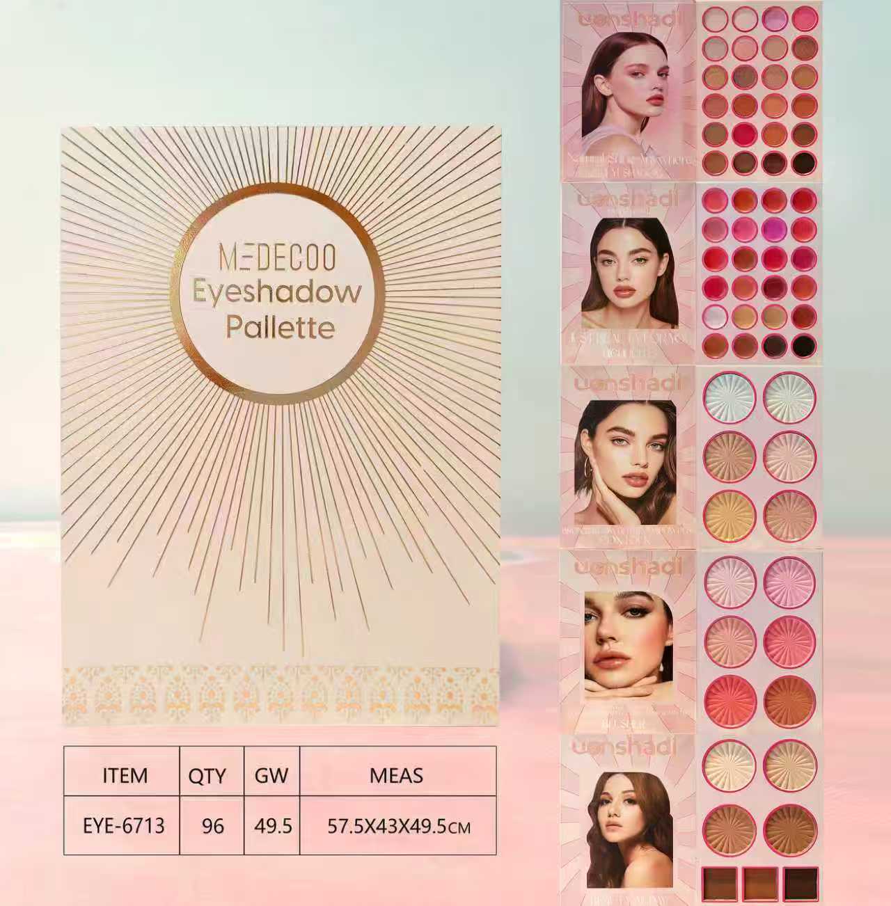
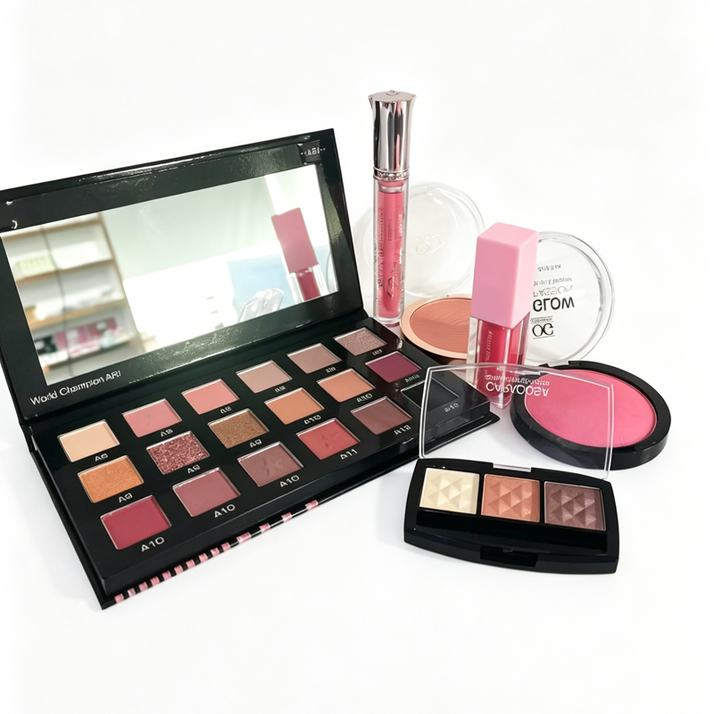
- 18 Colors Professional Makeup Eyeshadow Pallate
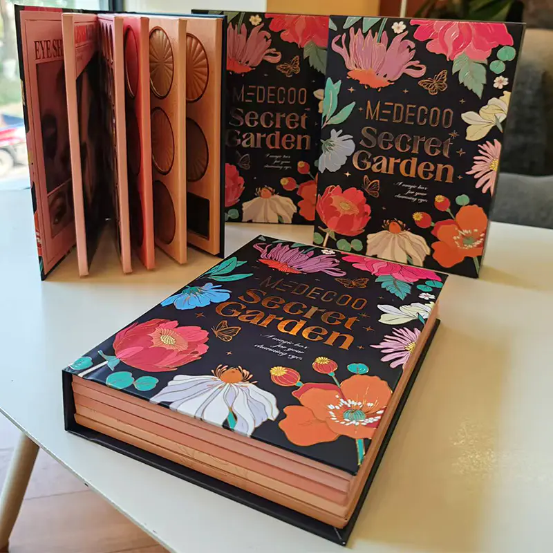
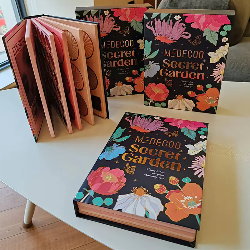
- All-in-One Makeup Book Palette Eyeshadow Palette
- Makeup Kit with Lip Liner And Powder
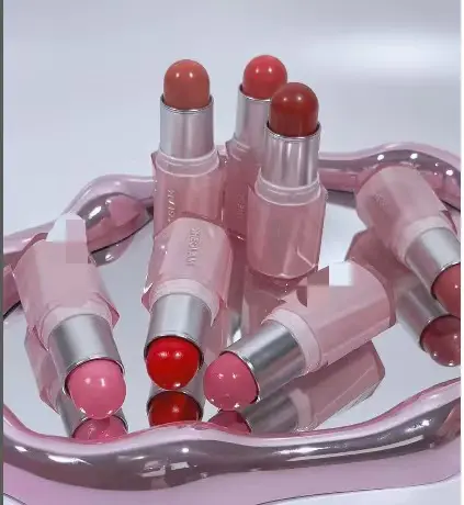
- Hydrating Cream Finish Italian Marble Sheer Lipstick
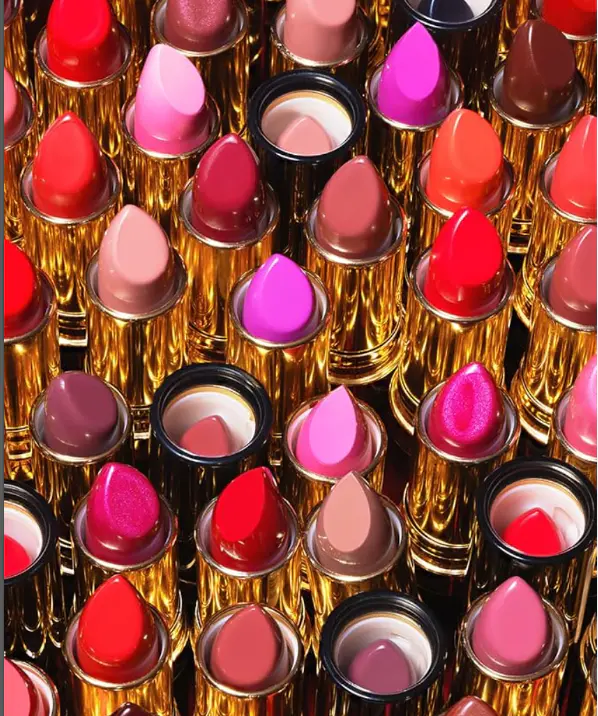
- Smudge-Resistant Rouge Hydrating Cream Lipstick
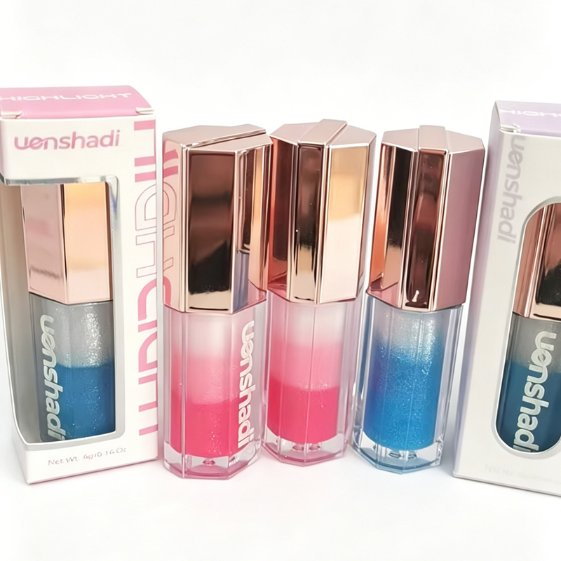
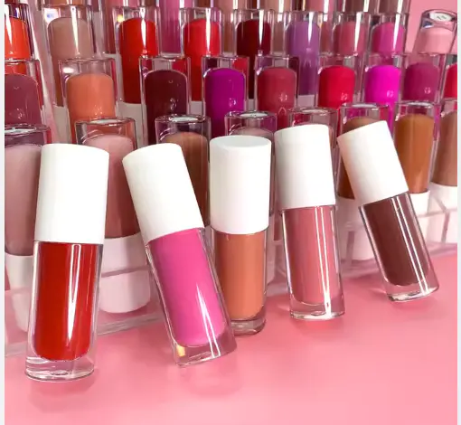
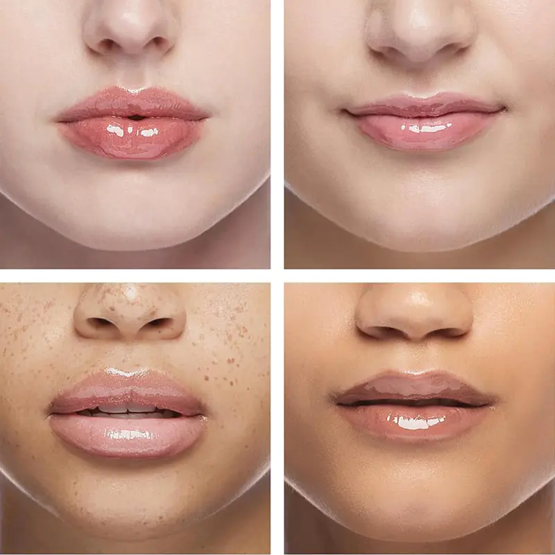
- Heart Shape Juicy Color Lip Glaze With Moisture Essence
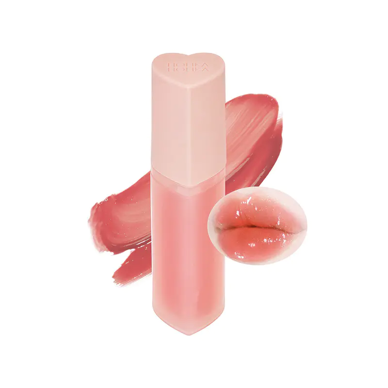
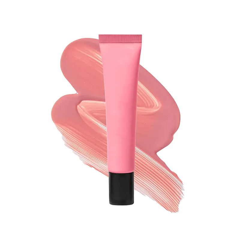
- Transparent Hydrating Plumping Cherry Lip Glow Oil
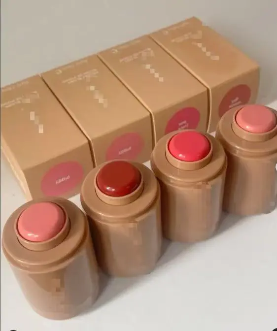
- Hydrating Nudescreen Liquid Blush & Lip Tint
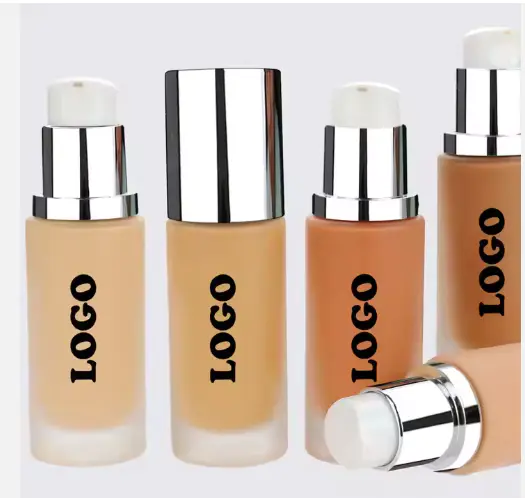
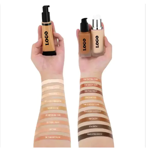
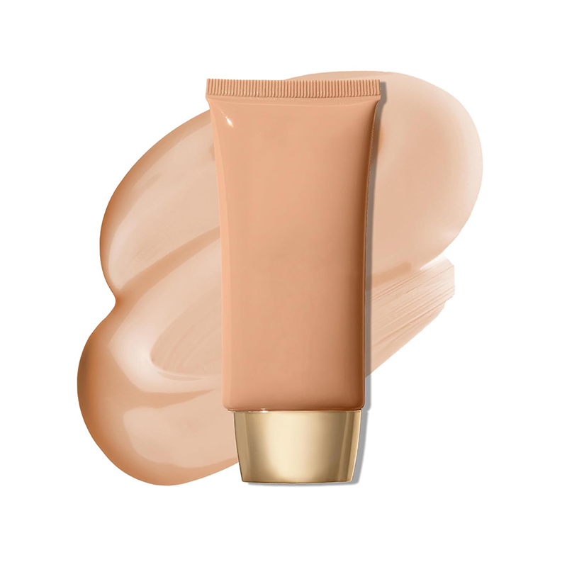
- Moisturizing Medium Coverage Dewy Foundation
- Natural Glow Finish Lightweight Hydrating Foundation


![]()
LINKS
PRODUCTS
CONTACT
-
 WhatsApp/Wechat/Phone:
+86-13423654553 -
 [email protected]
-
 No.818 Mingkai Street ,liushi Towm, dongyang City,jinhua, zhejiang, P.R.CHINA
MOBILE SITE
Copyright © Dongyang Qicai Cosmetics Co., Ltd. All Rights Reserved.

